
CASE STUDY
Moby's
Fish & Chicken
Restaurant branding, web design, and
marketing developed across a multi-year
partnership.
Website Design • Brand Identity • Menus • Promotional Design
CLIENT
Moby's
Fish & Chicken
INDUSTRY
Seafood
Restaurant
TIME FRAME
2007 - 2010
PRODUCT SCOPE
Website Design
Brand Identity
Logo Design
Marketing Materials
01
Project Overview
Sierra Digital Marketing began working with Moby’s Fish & Chicken in 2007, helping establish a cohesive visual presence across its brand and marketing. The work began with logo development and expanded into promotional materials, menu designs, and a custom website.
Across each project, the goal was to give Moby’s a recognizable identity that could carry consistently from its storefront and printed materials to its online presence.
Project Highlights
A selection of the key deliverables created during the project.
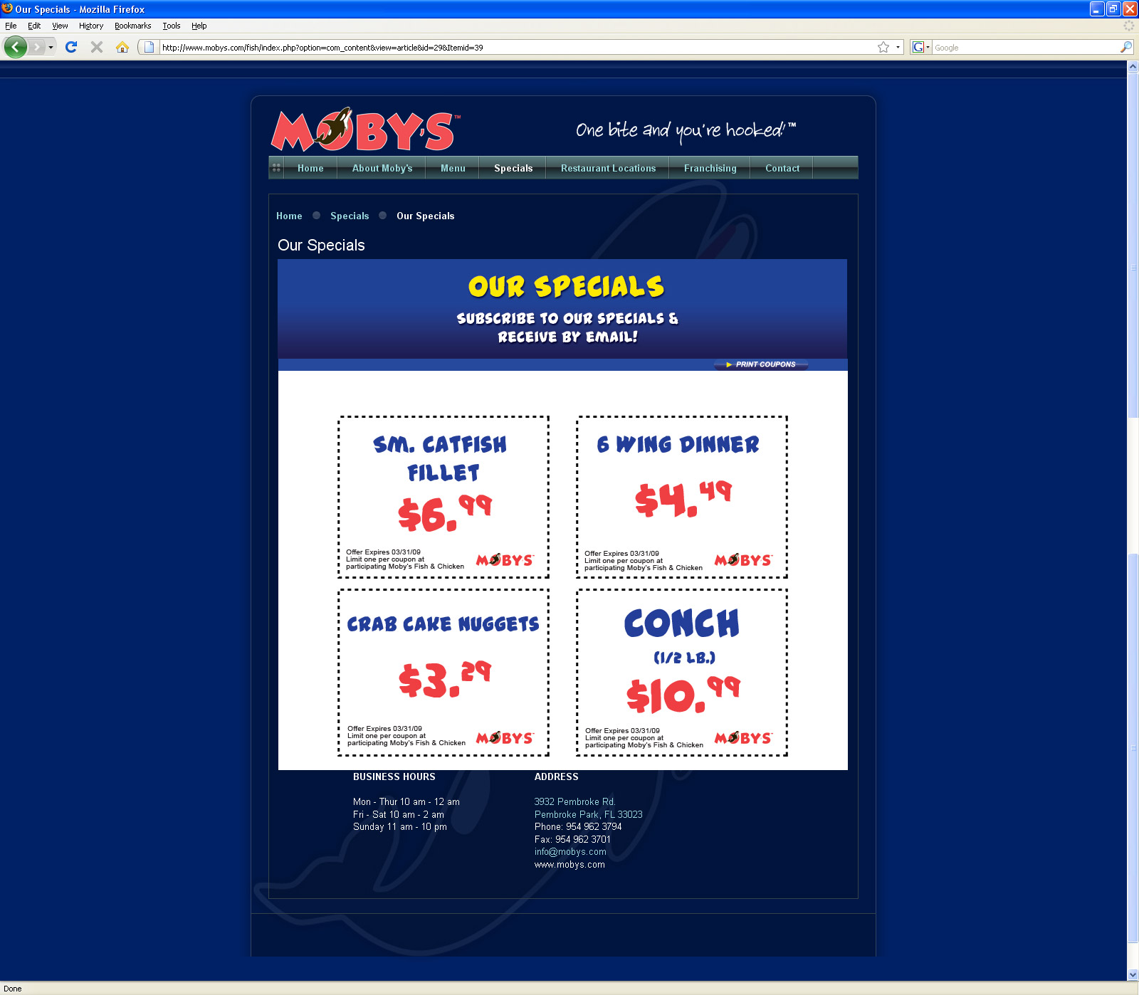
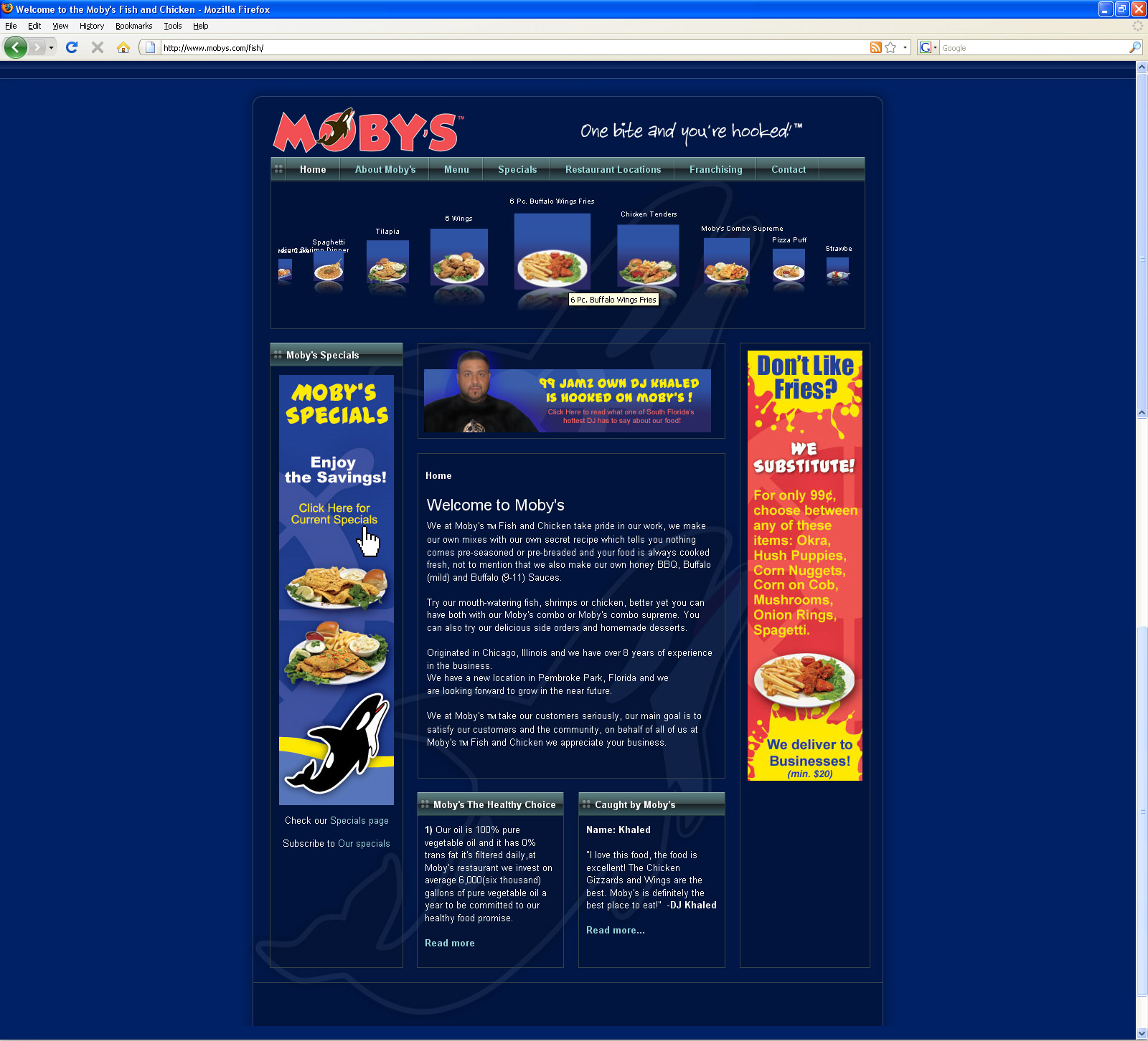
Website Design
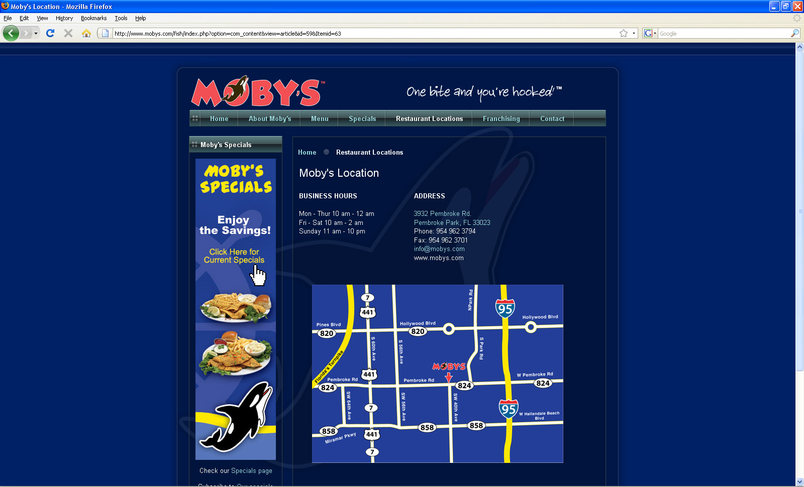
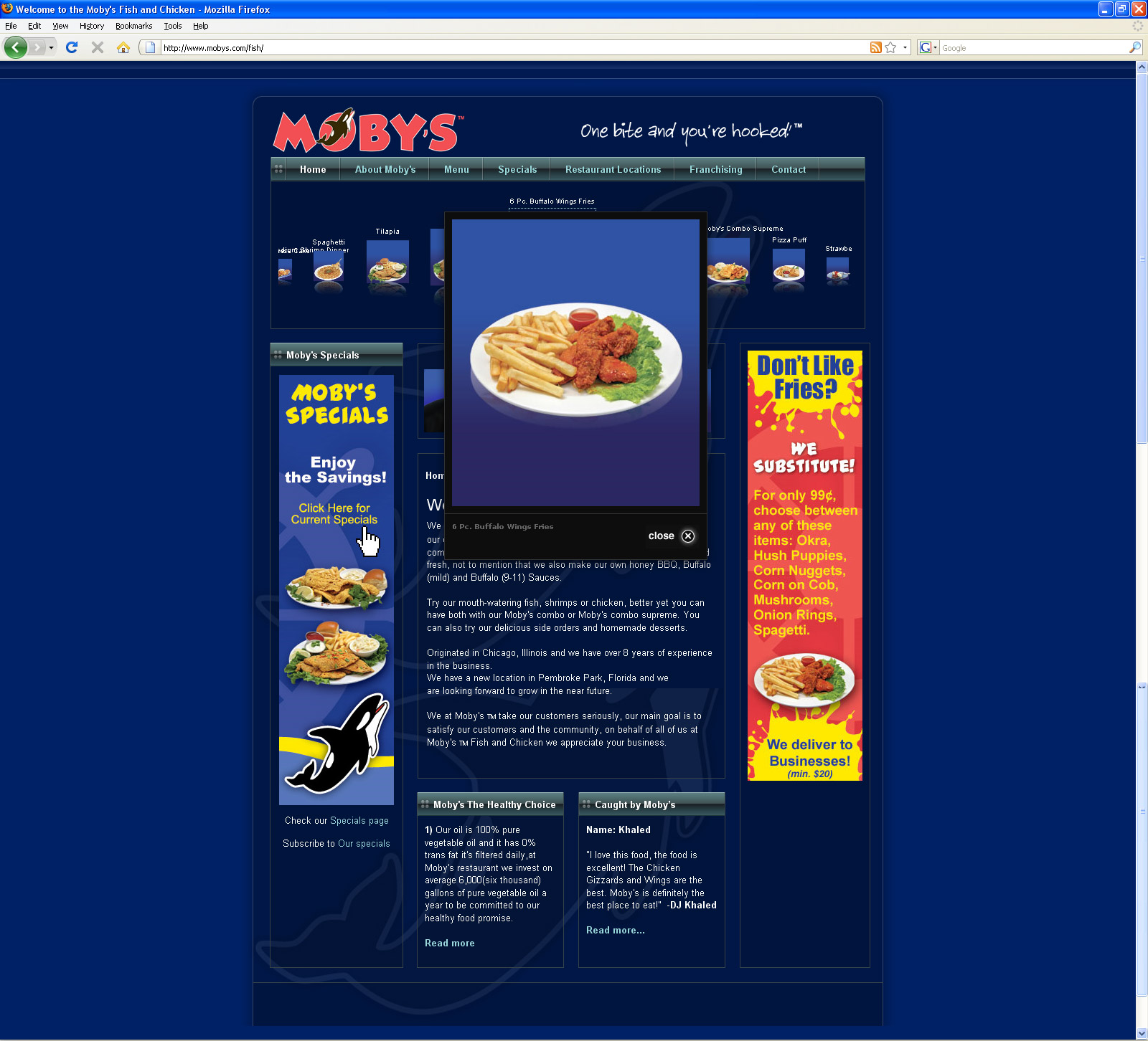
Moby’s website extended the restaurant’s visual identity online while giving customers an easy way to explore its menu, specials, and restaurant information.
The design carried the brand’s bold colors and graphics into a consistent digital experience.
• Custom website design
• Menu and specials integration
• Brand-consistent visuals
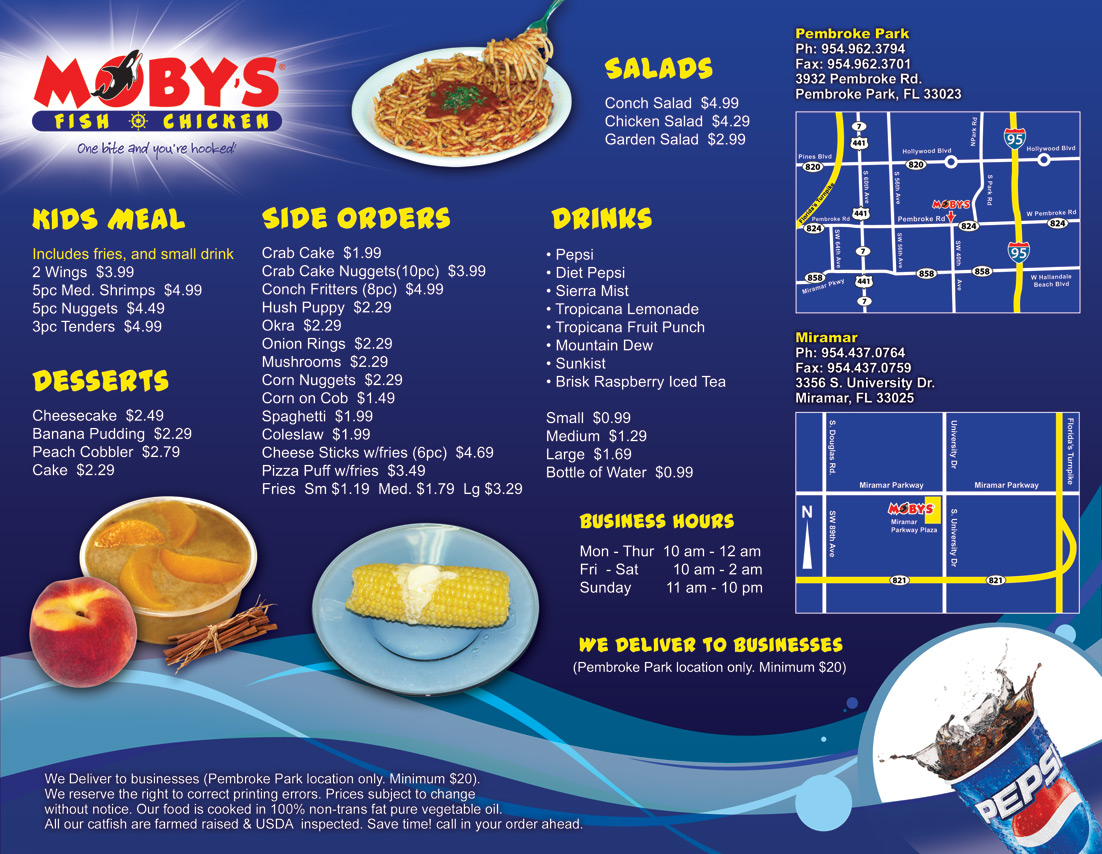
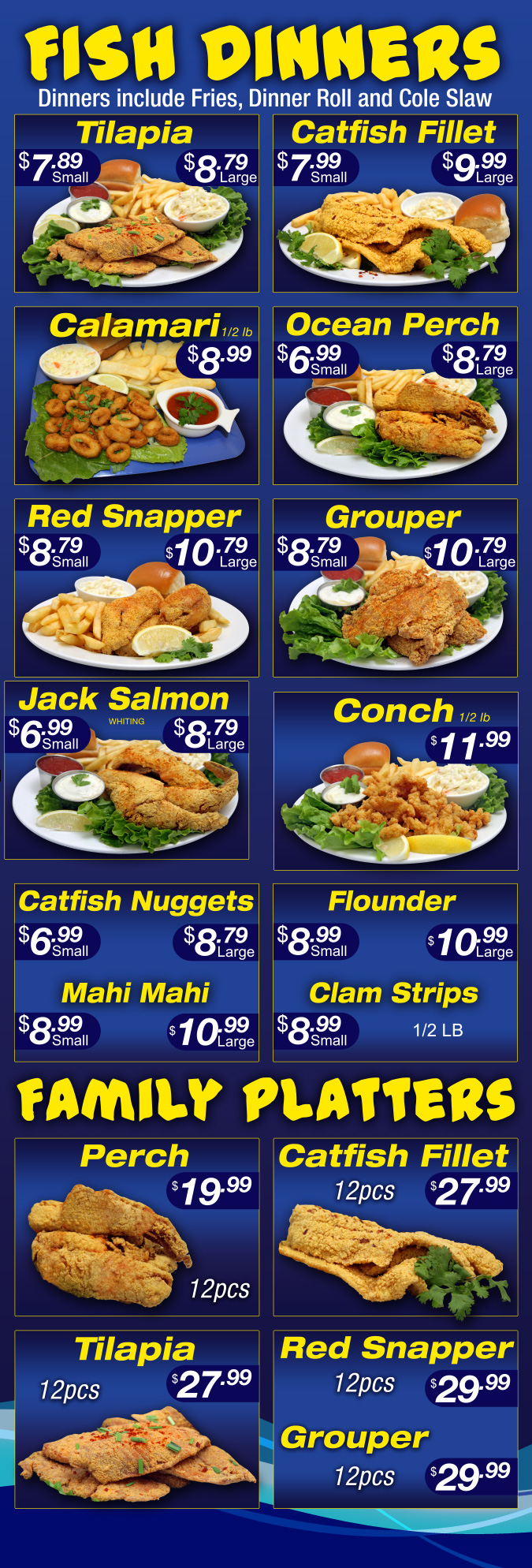
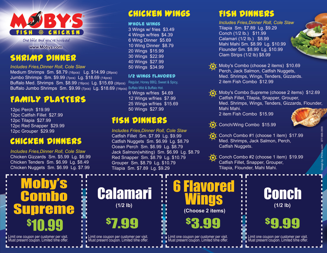
Menu Pages
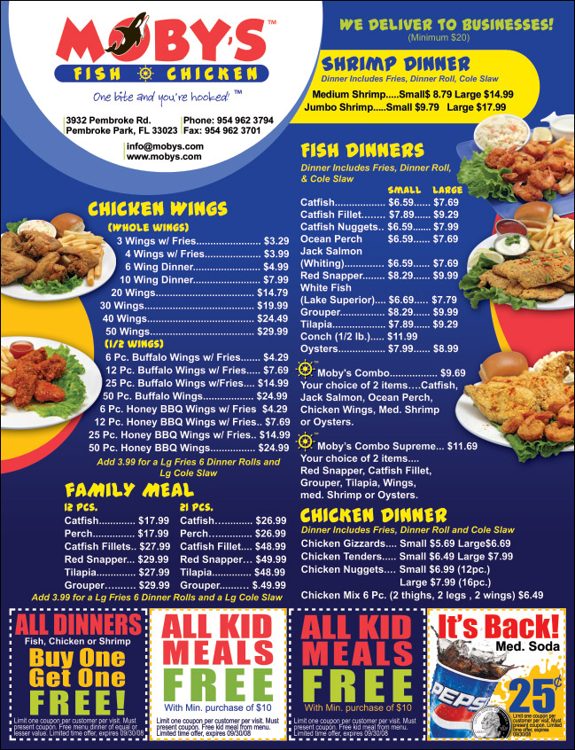
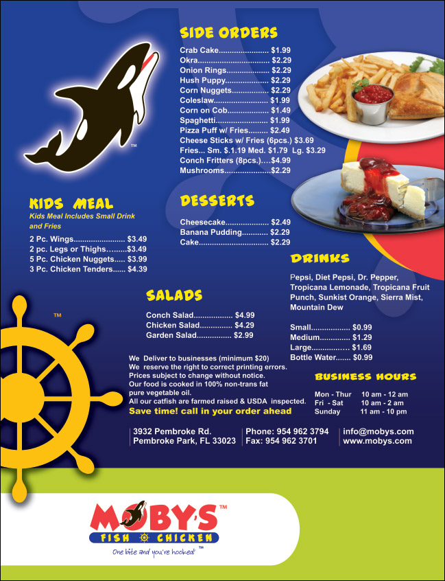
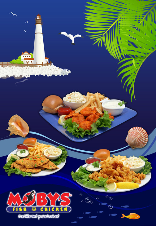
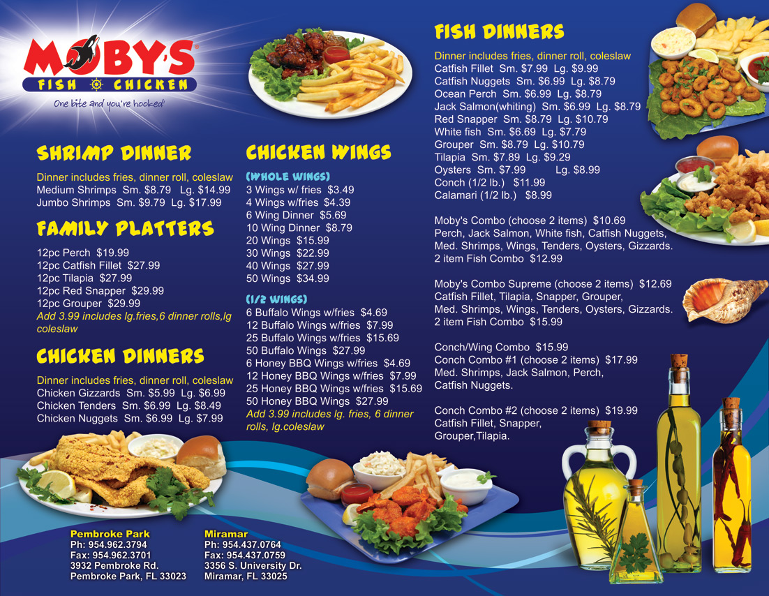
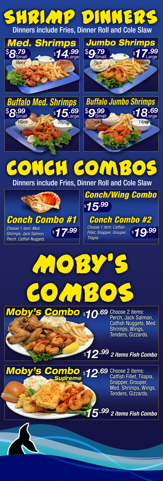
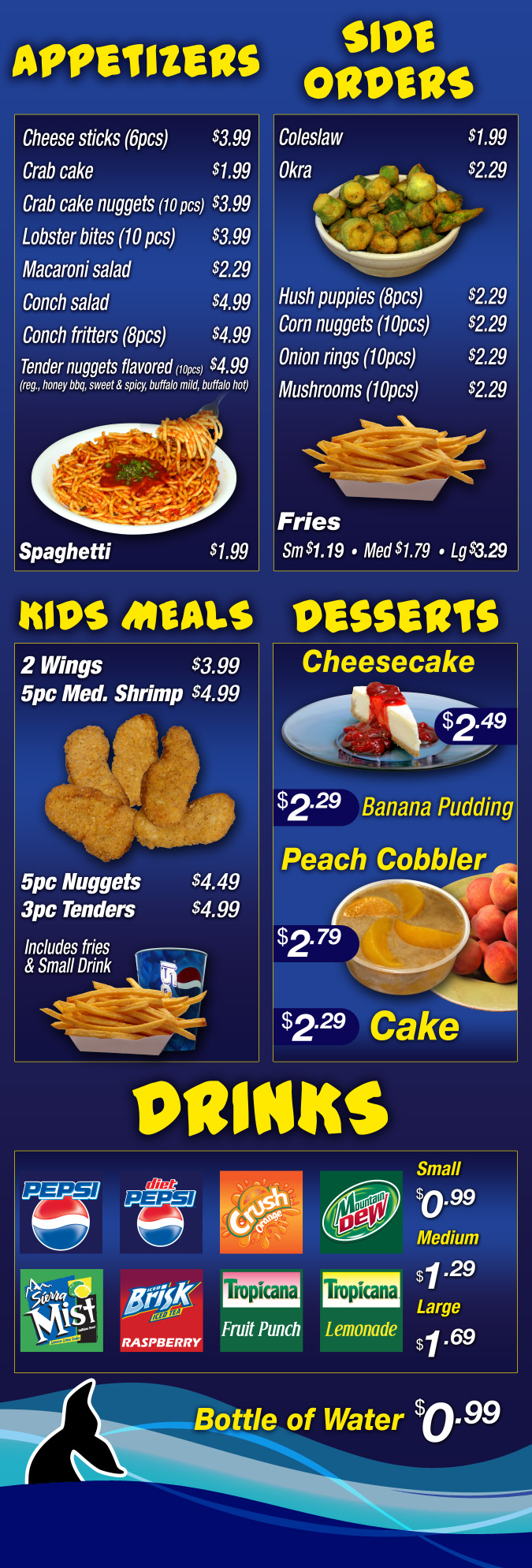
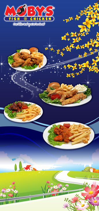
Moby’s extensive menu called for a design that could organize a large selection of food without losing the personality of the brand.
Bold colors, food photography, and clearly defined sections created menu pages that were both functional and unmistakably Moby’s.
• Menu layout and design
• Food photography integration
• Branded visual system
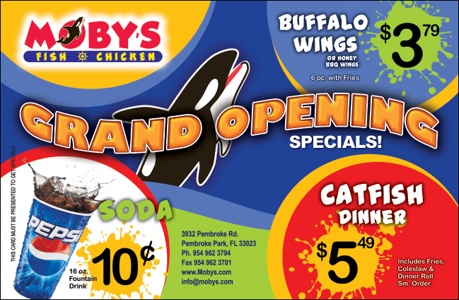
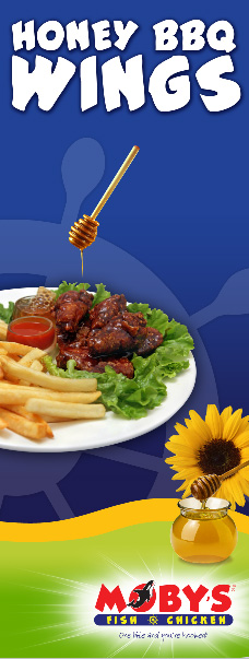
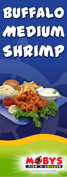
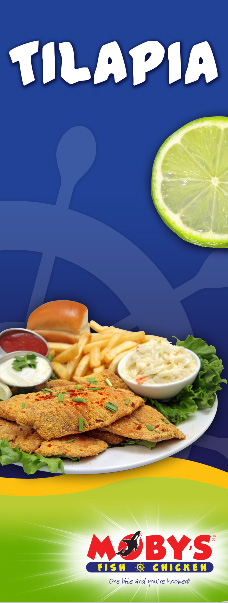
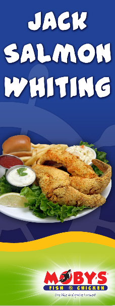
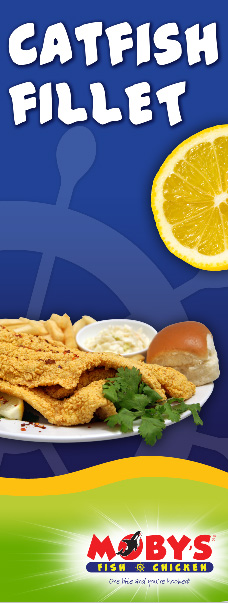
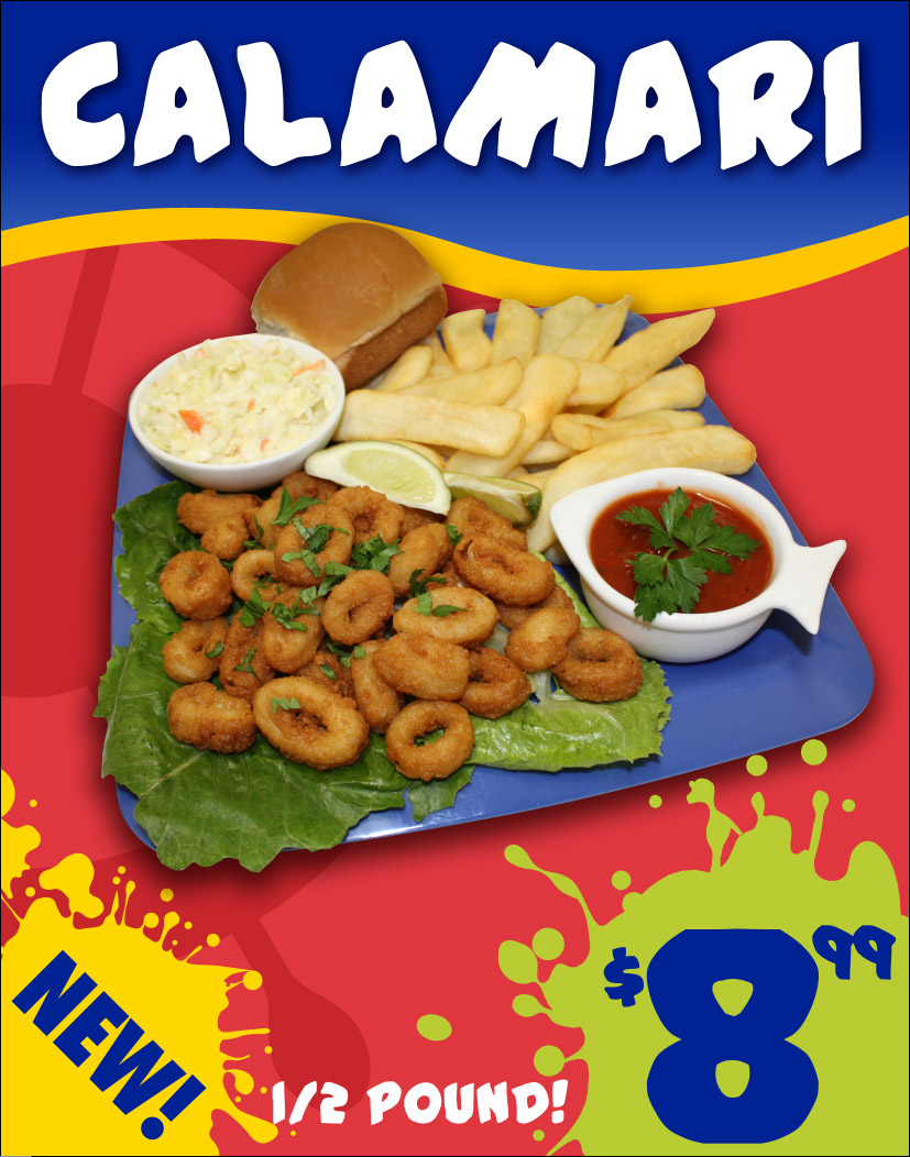
Promotional Flyers
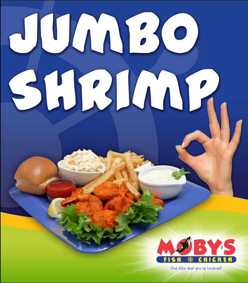
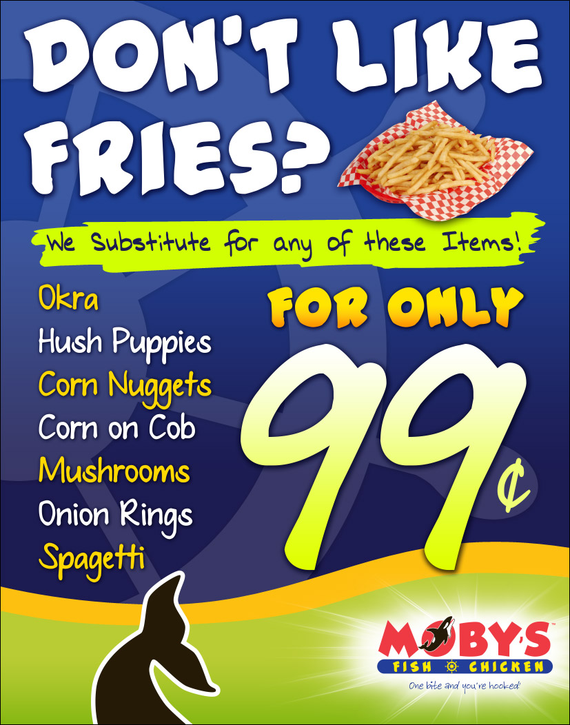
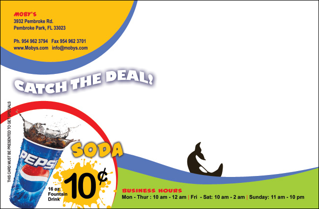
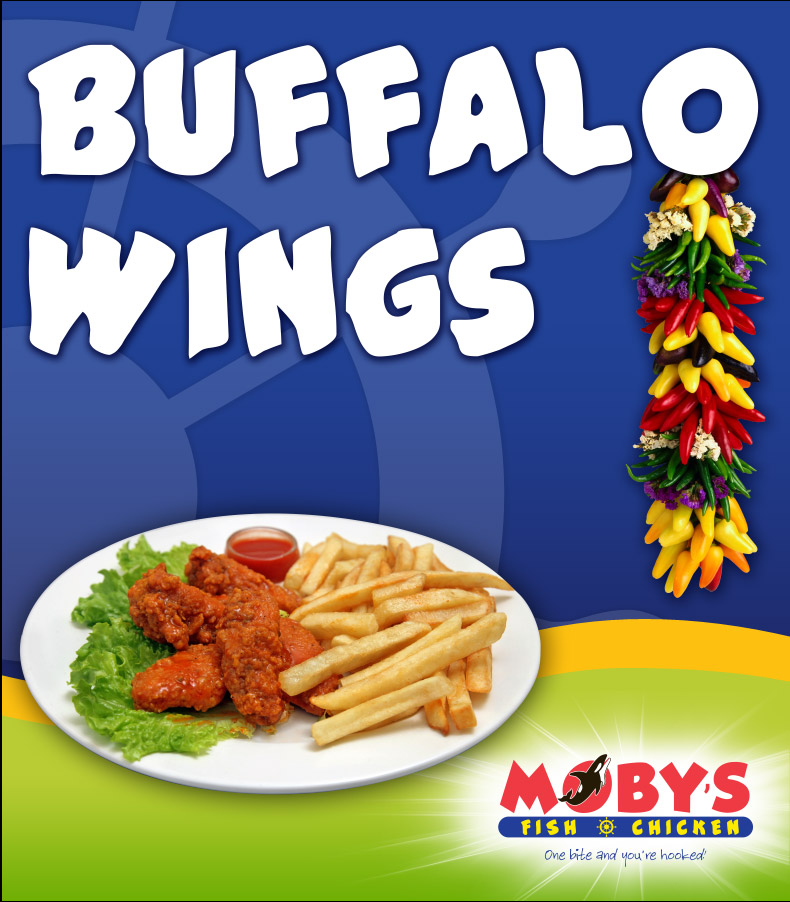
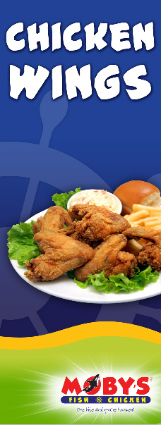
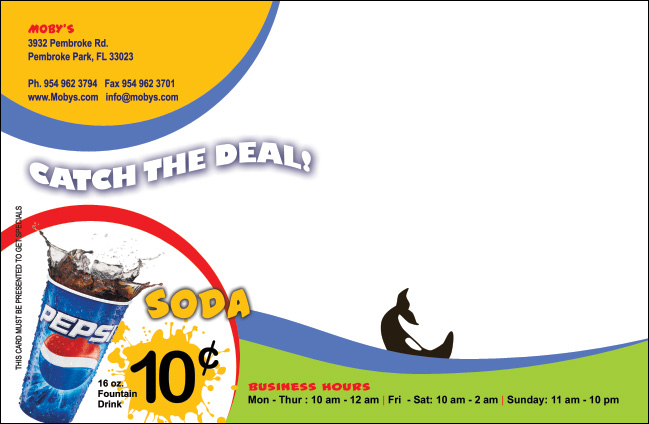
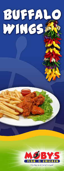
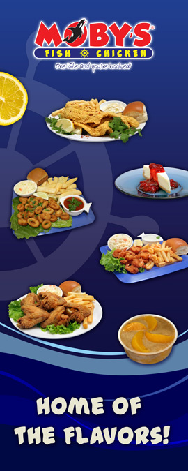
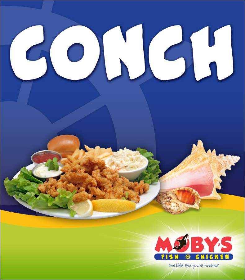
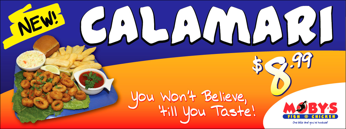
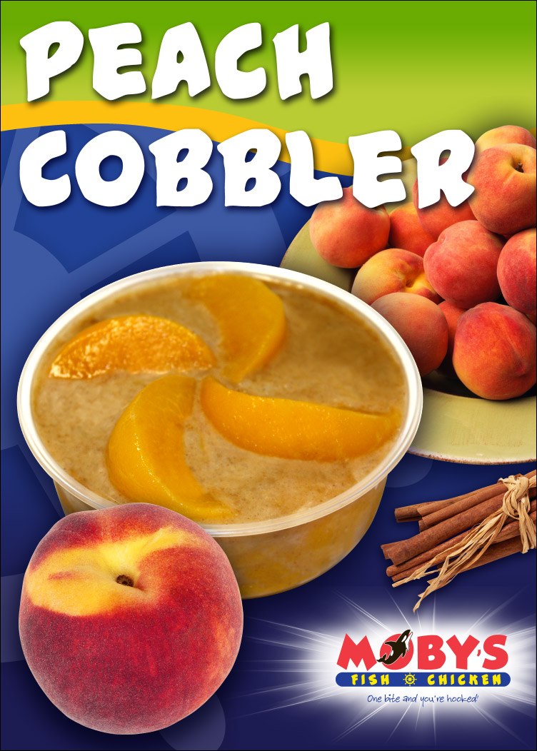
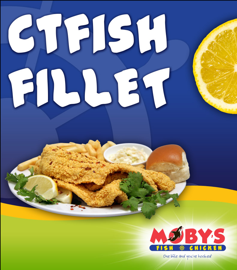
Promotional materials gave Moby’s a bold, recognizable way to advertise specials, featured items, and restaurant promotions.
Each piece combined energetic typography, strong food imagery, and established brand colors to attract attention while maintaining a consistent visual identity.
• Promotional flyer design
• Special-offer graphics
• Print-ready marketing materials
Logo Design
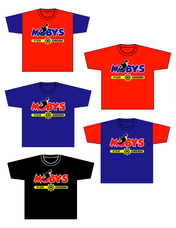
The Moby’s logo established the visual foundation for the restaurant’s identity, combining bold lettering, an orca graphic, and nautical elements into a distinctive restaurant mark.
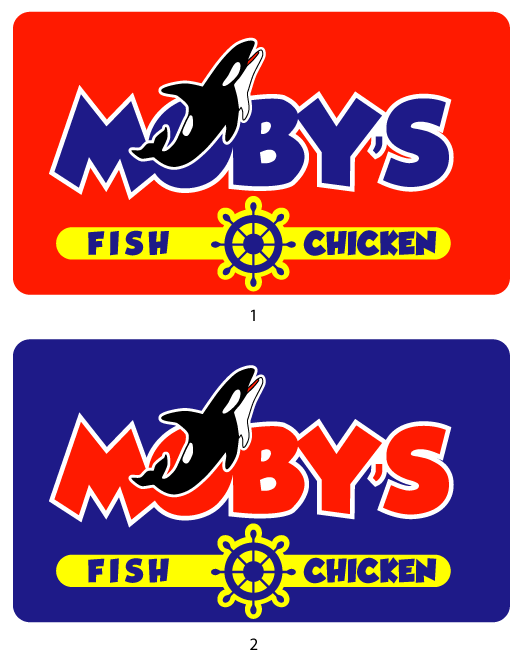
Multiple variations allowed the identity to work across signage, apparel, promotional materials, menus, and digital applications.
• Primary logo design
• Logo variations
• Brand applications
Gallery



What's Next for Your Business?
Tell us where your business is today and where you would like to take it. We’ll discuss what makes sense and how Sierra Digital Marketing may be able to help.